Friday 27 December 2013

Another disappointing Lions season draws to an end...

As a basketball fan growing up in England, my love of the NBA has been late to bloom. Well, when the time finally came to fall for the game, I first started to watch 'Football' through college games when Suh was dominating every game he played. Yes, I now know his disciplinary record is far from spotless!

Hence, when it came to him being drafted by Detroit, this fitted with me picking a team to follow. Oh why!! I hear you cry... Well for once the crowd is right. Here is my investigation in to whether individual player dominance on the offensive side of the ball brings success (as the other key Lions players are sitting on the offensive side after all). I have gone for a more journalistic style (the first foray of potentially many) to see if I can refine this art form. Thoughts in the comments below please and fingers crossed for next year!


Monday 16 December 2013

Was it always this bad? (Speed Visualisation)

It's dark outside and I have spent 10 hours with data at work and come home to find Tottenham have sacked yet another manager. So what is my coping mechanism, data visualisation of course. I wanted to explore whether I have lived through terrible Tottenham manager or has it always been this bad for Tottenham fans (yes the Double still offers a clue of the 'Glory Days' gone past). So i set myself a time limit of 30 minutes to create a visualisation to allow fellow fans to see whether they have it better or worse. Have you lived through a higher proportion of better managers than I have? Enter your date of birth to find out and use the filter to find out whether the Win % of managers you have lived through is better than mine (39%).

Monday 2 December 2013

Quality Father and Son (and Tableau) time

This weekend I took a trip home and at the same time, used some time with Senior Ninja (my Dad) to show him some of the work I do in Tableau. Four hours later, he was up and running and creating a visualisations on the fly.

So what did Tableau have to offer Senior Ninja?

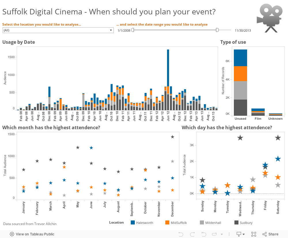
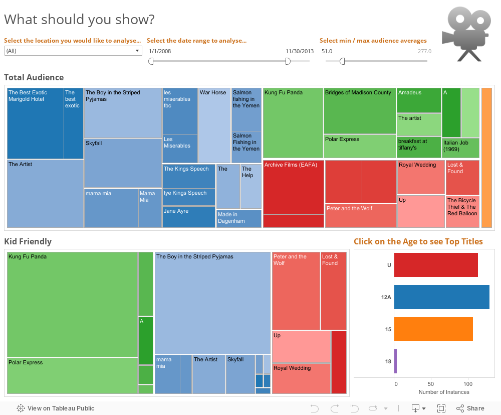
Well first of all, Senior Ninja is a very active man in the community. He has many roles (sound engineer, theatre technician, electrical engineer... the list goes on) but one creates data... a lot of data. As part of his web design work, he has a MySQL database capturing the use of community Digital Cinemas. He has never queried this database to see what was going on because he never had the chance.

To make the Tableau example real, I took a csv extract and loaded it straight in to Tableau. In seconds we had 10,000 rows of data telling us stories: most popular films, when the equipment is used, what different locations prefer... the list goes on.

Well, just letting Senior Ninja have access to the data is useful but at the end of the day, he doesn't control the input of the data; the users do. One issue with the data is the terrible quality of the data. Easy to fix in Tableau, but it takes time, so why not incentise the users to put in top quality data?

The best way I have found to do this is to allow users to see the data they input. This is where Tableau Public comes in amazingly useful as Senior Ninja can host the visualisations alongside the data input on his website.

Making the data better, will allow for better analysis, which will allow for better use of equipment, that will support more members of the community.

Win, win, win, win, all thanks to a bit of software and some quality father and son time. 

Tuesday 8 October 2013

Tableau Design Month - Tooltips

Tableau Public are rocking an excellent set of articles by some of the world's top users of the tool about how they design their visualisations to be the most powerful they can be.

Here's my thoughts on why Tooltips have been missed from this lost so far.

So why is something that is hidden important to design? 

Simply, de-cluttering a visualisation makes it appear more appealing, seem more accessible and in a time-pressured world, quicker to take in for a busy reader. The tool tip can hide a large amount of added detail and that detail can be really powerful to re-enforce the message of the viz. So how exactly would I use this in practice? Also, Tableau 8 allows the user to add additional information in to the tooltip without affecting the visualisation making it even more informative.


Helping tell the story
In the early days of my Tableau journey, I had Tableau’s own Andy Cotgreave present at a user community session showing some hints and tips (you’ll see a theme in this article). He showed me something that just made sense – restructure the tooltip to tell the story of what the user is looking at. The tooltip is the greatest help function on Tableau as it the most user intuitive way to offer the reader help. If a reader wants to explore something more closely, they are likely to move their mouse to that point. And this causes the tooltip to pop up – so why not use that action to tell the story in more depth? For example, what tells the user more, and in the clearest way?


Or


A simple bit of reordering the tooltip allows you to control what the reader will take from the visualisation and clarifies the point. A further design tip from Peter Gilks would be to remove the command buttons in the tooltip to stop a user accidently excluding values, and cleaning the tooltip up all at the same time.

Helping the less experienced user
Not everyone is a Tableau Zen Master or a Tableau-a-holic. For many readers, who might be even first time tableau dashboard readers or only looked at a couple of vizes before, you need to be able to show them what to do without filling the visualisation full of instruction. For most people who know to click on a dropdown parameter box or quick filter it’s pointless aiding over-explanatory descriptions to your visualisation. So how do you find the balance? This for me is where tooltips can be used to help the reader by creating a help button – Jewel Loree demoed the technique in the Tableau Quick Tips and Tricks at the Customer Conference this year and showed the example before (which hit a grand total of a million hits - so lots of new users!). Check out the '? How to use this Map' button...


By using an image as a shape, a tooltip appears when it is hovered over by the mouse. The tooltip tells the reader everything they need to use the viz and get the upmost from it. Genius and clean from a design perspective! 

There are a lot more things that smarter people than I have written about on the Tableau help forums, or in their own blogs. Go and explore and if you find something you like then add it to the comments below.

Happy visualising one-and-all! 

Sunday 6 October 2013

Welcome back NBA - salary analysis

After a long summer recovering from the San Antonio heartbreaking loss, the NBA returns at the end of this month. Like most American sports, the NBA has a salary cap that makes spending above the cap very expensive through additional taxes. The Spurs are known for managing their finances better than most whilst consistently challenging for the title. With Tableau 8.1 (in beta) allowing for Box and Whisker charts, the time was set for this analysis. In this visualisation I have used the new Box and Whisker chart type and Percentiles to explore the team's spending. Here's to a great season. Go Spurs Go!

Monday 23 September 2013

Stretching my lens...

So when looking for a break from data visualisation, I enjoy a little visualisation of a different kind. With the Tour of Britain in town, I thought it would be time to get out on to the streets and take a few snaps. Congratulations to Sir Bradley Wiggins for winning yet another title. A data viz on the upcoming World Championships sounds in order...

Tuesday 3 September 2013

#TCC13 Viz special - storytelling through the tooltip

Data Visualisation is great at allowing readers to understand more easily the information you are presenting to them. But what if you have more detail than fits nicely on a dashboard or chart? Well that is where the tooltip comes in. Packages like Tableau allow you to simply customise the Tooltip and add a lot more detail in like the example below in the ranking tables at the bottom of the dashboard.
Oh, and who said Spain was in Recession???

Saturday 17 August 2013

Vine videos to help show the way?

Is it time to end the .jpegs, like those used in the post below? Could short videoes, like those produced on Vine, help to show how to do something that words or a static picture just don't get across? What do you find easier? This?
Or?

Friday 16 August 2013

Who rules the (basketball) world?

Custom shapes have been used in many visualisations I have looked at but I hadn't ever tried to import my own images before. That was until now... So how do you do it I hear you ask? Well here's quick view. First, go and find 'My Tableau Repository' in your file structure. Here is the source of unlocking a lot of custom features in tableau (including bespoke colour palettes by using the 'Preferences' file).
Then, you simply create a new folder in the 'Shapes' folder. Call it what you like as this is what will appear in the custom shapes.
When creating your viz, simply click on the 'Shapes' part of the 'Marks Card' and then expand as follows:
So using the basketballs as a representation of the number of placings each country had shows that the US were not as dominant (especially at the World Championships) as one would expect.
Download the viz from Tableau Public and try custom shapes for yourself.

Thursday 8 August 2013

Free data for all!

Finding good sources are always like looking for a needle in a haystack (if that haystack looked like the freakin Matrix and you didn't have 'Neo' level abilities'. Well here is a link that I want to preserve on the blog because it does a great job at holding those I use (and will appear here in visualisations) and those I am yet to explore. Andy Kirk and co. have hit the nail on the head. Any more favourites?

Do the Spurs always get it right?

The San Antonio Spurs are known across the US Sports arena as the franchise that continually finds hidden gems in the annual draft. This is more remarkable with their continual success as this worsens their picks every year. But who has contributed the most? Are the international picks the secret to the Spurs success? Use the viz below and its Parameter (drop down box) to explore which picks have contributed the most. If you want to know more about how to create a parameter then stay tuned!

Welcome

Here is where I will post my explorations with data through visualisation. I love designing information so it becomes accessible for everyone who is interested so please enjoy and comment about what works and what doesn't.

Here is a starting place - all the number one albums up to earlier this year