So when looking for a break from data visualisation, I enjoy a little visualisation of a different kind. With the Tour of Britain in town, I thought it would be time to get out on to the streets and take a few snaps. Congratulations to Sir Bradley Wiggins for winning yet another title. A data viz on the upcoming World Championships sounds in order...
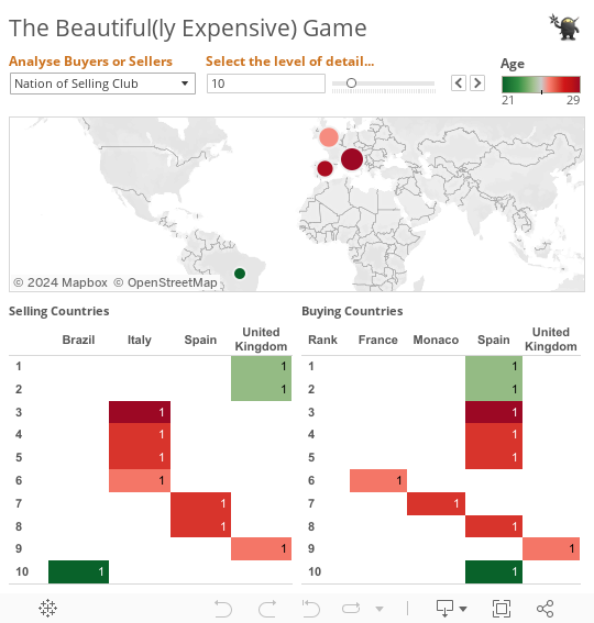
Data Visualisation is great at allowing readers to understand more easily the information you are presenting to them. But what if you have more detail than fits nicely on a dashboard or chart? Well that is where the tooltip comes in. Packages like Tableau allow you to simply customise the Tooltip and add a lot more detail in like the example below in the ranking tables at the bottom of the dashboard.