Tuesday, 3 September 2013
#TCC13 Viz special - storytelling through the tooltip
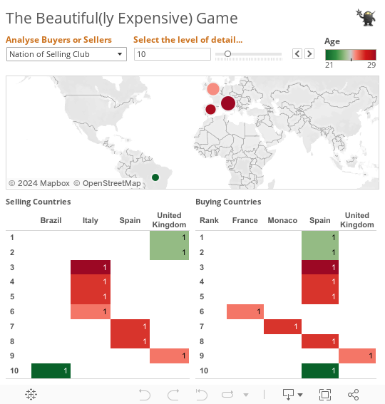
Data Visualisation is great at allowing readers to understand more easily the information you are presenting to them. But what if you have more detail than fits nicely on a dashboard or chart? Well that is where the tooltip comes in. Packages like Tableau allow you to simply customise the Tooltip and add a lot more detail in like the example below in the ranking tables at the bottom of the dashboard.
Oh, and who said Spain was in Recession???
Subscribe to:
Post Comments (Atom)
No comments:
Post a Comment