Monday 17 March 2014

Tableau's Sports Viz Contest - the Interactive Shot Chart

So Tableau have thrown down the gauntlet and it's the first data viz competition to see who gets to complete in the Iron Viz championship at the Customer Conference. I had the pleasure of watching the competition last year and it was great. Seeing three great visualisers tackle the same data set in so many different ways made me feel there is no right way - it's all about the experimentation to see what stories you can find.

This year's first challenge is to create a sports based visualisation. For me there was only every going to be one thing I was going to do and it was to create an interactive basketball shot chart. For a long time now, I have admired and followed the work of Kirk Goldsberry. For example:


Kirk's chart are simply beautiful, fun and clear. I really enjoy the comic book (graphic novel??) styling. But, I want a little more...

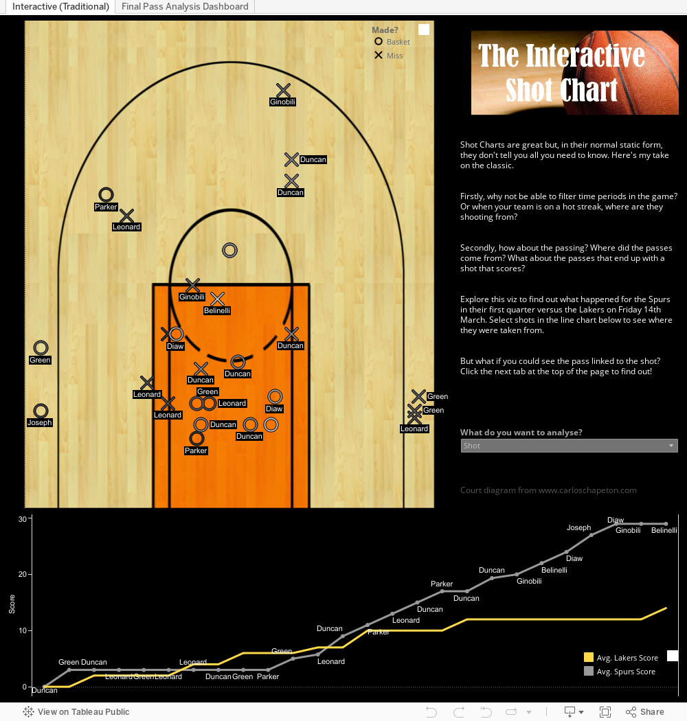
I want to understand: When the shot is happening? Who made the pass? What was the flow of the game at the time?

But linking the final pass to the shot tells an even more interesting story - click on the second tab to see how path analysis helps with this. Just check out Spurs dominance on the defence's right hand side after failing from the left before hand.

Therefore, I have created this as my entry in the Iron Viz competition. I hope you enjoy it as much as I enjoyed creating it.


Thursday 13 March 2014

It's Tableau Sports Viz month

Anyone who knows me, knows I am basketball obsessed! 

I recently realised that I often form ideas when watching games. Who is the best 3 point shooting team? Who scores well from the three point line, but fails miserably as a foul shooter?

A while ago I created this for the 2011-2012 season (and will update shortly) but I have been watching games recently and haven't had my laptop close-by. So I'm publishing this to the blog so it is available whenever I get in to a debate about how great Kawhi Leonard is, I can prove it!