Thursday, 26 June 2014

The Revised NBA Draft

The NBA draft is the equivalent of Christmas for most NBA fans (except Cleveland but I will come to that). Previously for the last couple of decades, David Stern (playing the role of Santa) rocks up to the podium (read Christmas tree) and tells you which teenager you will be cheering on for the next decade.

This year Adam Silver, the new NBA Santa, will read out the names of the players in which your sporting hopes will rest. If you have been good (or your team has an awesome GM) then you will land a star player that will guide your team to championship, after championship (thanks Timmy!). If you are Cleveland or Portland then you draft a player that will leave you for a more desirable location or have fundamental health issues.

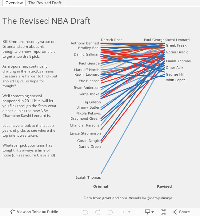
So how much does it matter if you pick first, second or sixtieth? Bill Simmons, king of Sports Satire, this week published an article looking at which order the players from the last couple of decades would those players go.

Here's the article for those who want to have a read - http://grantland.com/features/nba-draft-crapshoot-repick-1995/

Well as I was reading, I thought of only one thing - slope chart!

I hope you enjoy the new storyboarding feature in Tableau as I walk you through the last six years of the NBA draft showing there is still hope for all.


Monday, 26 May 2014

Quantified Self


I have the joy of living in London. This includes many amazing things: the history, the architecture, the museums, the beer but there is one thing that blights the London experience for me - the Tube.

That's right the London Underground is my pet hate. Don't get me wrong it's a brilliant transport system - people make 24 million journeys on it every day (tfl.gov.uk). But that is the issue for a 6' 3" guy, I just don't fit in very well. So for a quantified self project I wanted to not just help myself solve this, but create something that will help others. So I came up with...

The London Runderground.

Every year about 15 million international tourists come to London and they move round primarily on the tube. But they have no other option if they want to visit the sights, right? No Wrong! Why not run between the attractions?

To prove the benefits I have tried to be as fair as possible. I didn't train for the runs, I didn't do it on a nice cool day (it was a stifling London day), I just rocked up in a pair of trainers and my iPhone (to use RunKeeper.com) and ran. I have just used the tfl.gov.uk website to calculate the tube journeys but these don't take in to account:

  1. The time to get from the attraction to the station
  2. The time to get down to the platform once at the station (there are a lot of escalators)
  3. Delays
  4. Line closures

Here are my results - and trust me it is a lot nicer than riding the tube for nine journeys (and cheaper!!). Plus, I made a couple of journeys faster. Oh and the biggest benefit is I could enjoy my fish and chips in the evening as I had already worn off the "treat".

Monday, 17 March 2014

Tableau's Sports Viz Contest - the Interactive Shot Chart

So Tableau have thrown down the gauntlet and it's the first data viz competition to see who gets to complete in the Iron Viz championship at the Customer Conference. I had the pleasure of watching the competition last year and it was great. Seeing three great visualisers tackle the same data set in so many different ways made me feel there is no right way - it's all about the experimentation to see what stories you can find.

This year's first challenge is to create a sports based visualisation. For me there was only every going to be one thing I was going to do and it was to create an interactive basketball shot chart. For a long time now, I have admired and followed the work of Kirk Goldsberry. For example:


Kirk's chart are simply beautiful, fun and clear. I really enjoy the comic book (graphic novel??) styling. But, I want a little more...

I want to understand: When the shot is happening? Who made the pass? What was the flow of the game at the time?

But linking the final pass to the shot tells an even more interesting story - click on the second tab to see how path analysis helps with this. Just check out Spurs dominance on the defence's right hand side after failing from the left before hand.

Therefore, I have created this as my entry in the Iron Viz competition. I hope you enjoy it as much as I enjoyed creating it.


Thursday, 13 March 2014

It's Tableau Sports Viz month

Anyone who knows me, knows I am basketball obsessed! 

I recently realised that I often form ideas when watching games. Who is the best 3 point shooting team? Who scores well from the three point line, but fails miserably as a foul shooter?

A while ago I created this for the 2011-2012 season (and will update shortly) but I have been watching games recently and haven't had my laptop close-by. So I'm publishing this to the blog so it is available whenever I get in to a debate about how great Kawhi Leonard is, I can prove it! 


Sunday, 9 February 2014

Previously on 24...

Fate made me make the first 24 visualisation due to a conversation in the office, and it has had it's hand in this follow up entry too.

With the help of the previous entry, my blog hit 24 hundred views (2,469 to be precise) so a follow up had to be made - fate made it so!

So what else can be looked at in 24 through the eyes of adata visualiser? Deaths, thats what. I stumbled up (read googled) a great source of 24 knowledge - a wiki dedicated to 24! Click the link, its' worth it: http://24.wikia.com/wiki/Deaths_on_24

So did Jack Bauer stop the 'Hostiles'? Were the public safe? Use the visualisation to explore who were the killers. And this is more evidence that you can truly create a data visualisation out of anything (especially with Tableau).


Sunday, 19 January 2014

So what can you visualise?

With rumours circulating the internet about a new Season of 24 (and a movie to boot!), I thought two things:

1. It's been a while since I watched a series and the English weather is defintely condusive to this at the moment.
2. Is it worth making Series 9?

Well, instantly, young Miss Jedi Ninja stuck Series 7 on Netflix and I reached for the laptop to create a visualisation exploring viewing figures over the different series. And this led me to a conclusion, data analysis through tools like Tableau, can now measure pretty much everything and you can analyse data to understand the wider context.

Recent data visualisation highlights for me covering Pinball Machines (@paulbanoub), fantasy basketball (@dataremixed) and burning off your favourite foods in the Gym (@matt_francis) show that there really isn't any topic that it is now not possible to create a data visualisation about to aid your decision making as to whether you are: trying to make your gym trip more efficient, winning your basketball fantasy league, or, running your own Pinball Arcade business.

So google what you are interested, see if you can find some numbers and see if you can find you the underlying story in the numbers. And then let the world know because you never know who you might be helping! (just maybe not as much as saving the World like Jack Bauer)


Friday, 27 December 2013

Another disappointing Lions season draws to an end...

As a basketball fan growing up in England, my love of the NBA has been late to bloom. Well, when the time finally came to fall for the game, I first started to watch 'Football' through college games when Suh was dominating every game he played. Yes, I now know his disciplinary record is far from spotless!

Hence, when it came to him being drafted by Detroit, this fitted with me picking a team to follow. Oh why!! I hear you cry... Well for once the crowd is right. Here is my investigation in to whether individual player dominance on the offensive side of the ball brings success (as the other key Lions players are sitting on the offensive side after all). I have gone for a more journalistic style (the first foray of potentially many) to see if I can refine this art form. Thoughts in the comments below please and fingers crossed for next year!