Sunday, 12 June 2016

Why invest in yourself at the Conference?

Self-reflection is a great thing. Looking at yourself in the mirror and understanding what gaps you have in your skillset despite being considered good at what you do is really healthy. For all those Tableau Jedis and Ninjas, now is the time to do that… it’s conference season! Work out what those knowledge gaps are and hit the conference sessions that will fill those gaps (or canyons in some cases). 

Whenever I mention that I’m off to the Tableau conference, I normally get one response – “enjoy the party” and they are right, the partying is great. But attending the conference has some career benefits too.

1. Knowing what is coming soon
No Tableau Ninja worth their salt won’t have an eye to the future. Keeping your eye on what is getting voted up on the Ideas forum but seeing what is coming soon during the ‘Devs on Stage’ session at the conference is something else. Often, the features won’t be in the live version for some time but being able to explain what is coming can help your Clients or Colleagues plan for the future – do you need to invest in a different mobile reporting tool or will the app upgrade hit the spot. Is it time to polish up those Table Calculation skills or has Tableau just made life easier by redesigning their implementation.


2. Learning
Before I joined The Information Lab, the main learning opportunities I had was to attend the conferences to seek out new techniques, hints and tips. And those learning opportunities are everywhere. The Zen Masters’ sessions will show skills that are often a stretch for all but the other Zens but knowing what is possible will help you when you get that project that you’re not sure whether can be done in Tableau or not. The Product Consultants are also a great source of knowledge. They are likely to have spent the most time with some of the newer features so the Product Consultant sessions are great ones to attend. I think everyone still lives by Bethany Lyons Level of Detail sessions last year. The best thing is, what is learnt is often shared in snippets on Social Media.
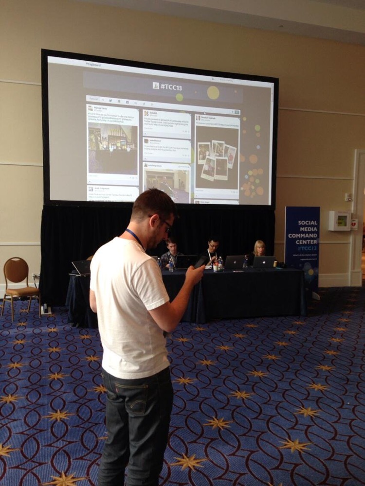


3. What other companies are doing with Tableau
If you are a consultant, you get to see a lot of different organisations introduce and grow Tableau. This knowledge is valuable in understanding what to and what not to do. If you’re not a consultant or haven’t got the budget to stretch to getting some of our time, then hearing from customers’ experience is the next best thing. In my first Tableau conference (London 2013), I was lucky enough to get to present Barclays’ Tableau journey with Peter Gilks. Whilst it was fun reflecting on the work we had done, it was great to get feedback from the audience on what else we could look to do that they had found to be successful. I still get people come up to me and thank me and Peter for inspiring them to get behind their Tableau deployment (or give it a go) and love how much the hints and tips helped them to develop faster.


4. New Cities – new experiences – new friends
Getting to travel to the conferences gets you to see more of the world. Here’s Peter and I in New York before we headed Washington DC for the Global conference in 2014.


Little did either of us know that the global conference was going to be the chance to cement all the friendships we had started to form on social media. Data Geeks are often insular by nature but there is something about going and spending time with those who share the data visualisation passion that makes chatting to others easy. As you can see, we are a shy and retiring bunch.


So, what more could you want? Learning opportunities everywhere you turn, knowing what is coming next in your favourite data tool and the chance to meet some fabulous people. See you in London, Munich and Austin folks – come and say hello.

Sunday, 22 May 2016

Makeover Monday...well kinda

Every week Andy Kriebel and Andy Cotgreave have been running an initiative to get more people visualising data and thinking about the pros and cons of different visualisation types. I really enjoying seeing what comes through the twitter feed in terms of imagery and discussion about the visualisation.

This week, like a true Sunday in May, it's raining outside so instead of being on the bike, it's time I got stuck in. In my title I describe this as "kinda" Makeover Monday as yes I have written it on Sunday but more importantly it's not a makeover.

The visualisation I have created appeases my own interests instead. When I was 'making over' the original visualisation by taking multiple looks at the data through different charts type (always do this) to see what was coming through the data about the original subject (the increasing imports of middle eastern countries) I found the Soviet Union / Russia position much more interesting.

Despite ending up in a technical job, I am actually a History and Politics graduate and my dissertation was on the Russian Intelligentsia after the fall of Communist Russia. Therefore, when the I saw the dominance of the US and USSR spending throughout the height of the Cold War, I was hardly surprised. When the USSR did disappear, I was expecting Russia to record a huge amount of either Imports or Exports. But no, it took Russia until 2006 to make an appearance after 1993. The provision of Arms by the US doesn't surprise me but the fact that Russia has such a high surplus does.


I built this visualisation in v10 beta of Tableau to aid the beta testing so am not able to upload it to Tableau Public but will at some point. I'm still looking forward to seeing what other people come up with but am intrigued as to what other stories are in the data.

Tuesday, 10 May 2016

Creating an easy user experience when using multiple data sources

The challenge: can you let the user pick the last 'N' amount of values? Easy!  

The problem: you have two data sources, those data sources are at different levels of granularity (one months, the other days), they cover different date ranges. Suddenly, not so easy! 

Here's how I worked around it (and a sneaky look at Tableau version 10)


Wednesday, 20 April 2016

To Bee or Not To Bee - IronViz 2016 - First Qualifier

Iron Viz is my favourite competition of the year. Each single qualifier pushes you to produce a visualisation on a different subject. I see it as a chance to learn some new skills and try different techniques that I don't always get the chance to in my everyday work.

The new technique for me this time was Hex Maps that I've seen on a number of visualisations but not tried myself beyond my Steph Curry visualisation from late last year. Luckily I found a great blog post by Matt Chambers 

This time, the Iron Viz theme is food. It took a while to come up with a good idea. The data sets just weren't as good as the ideas I wanted to explore. Until a trip home reminded me of a subject that should be important to everyone. Bees!

Bees pollinate all plants so without them we are going pretty hungry (fish wouldn't last for long with 7 billion mouths to feed). There has also been a lot of press about the decline and threats to bees over the last few years so I really wanted to quantify what has changed over the last 10 years.

So here it is: To Bee or Not To Bee (click on the image to go to Tableau Public)


Friday, 8 April 2016

5 things you probably never realised were there in Tableau

I know it’s a little late as Tableau’s tips month was March but it was a crazy month for me. I haven’t even caught up on all the tips that were posted (apologies if someone beat me to these).

Tableau has a very clean User Interface and to achieve this, hundreds of hours of work has gone in to only letting users see the options that are relevant at the right time. However, I often see that Tableau is sometimes too good at only showing the right things. It’s easy for Users to miss what is staring them in face so here are a few of my favourites. I’d love to hear yours!

1. Replacing the axis in the view
Ever wondered what that black square is when you hover over a green data field over an existing axis? When you release your mouse button, you will replace the existing axis with your previously hovered data field if you release it over the square. If you don’t release the field on the square, then you will trigger Measure Name / Measure Values as you are placing two data fields in to one space.


2. Percent of Total in the Analysis menu
I was teaching when I found this one. Someone in my class piped up saying they could create a table calculation in the analysis menu – I love learning from others. The best thing about this technique is that the table calculation persists even if you change the measure you are analysing – brilliant!


3. Edit Calculated Field in the Analysis Menu
Ever create the greatest calculation known to human kind. Click ‘ok’ in the calculated field window and then can’t find you calculation you just created as you can’t remember what you called it. Don’t worry me too! Go to the Analysis menu and ‘Edit Calculated Fields’ and there is a list of all your calculations that you have created (and Number of Records). You calculation will be lurking in this much smaller list. 


4. Include in Tooltip – right click on data field
Another recent find that I have seen before but never thought to use. Great if you don’t want something in your Tooltip but don’t want to edit the whole tooltip. Right-click the data field you want to remove from the tooltip and untick ‘Include in tooltip’. 


5. Button underneath the Window Option – to show filters quickly
No great list on the internet included just four entities. Therefore, I went in search of other areas I had never seen / thought about in Tableau. Hello there little icon under the Windows menu option! When hovering your mouse over, you get the pop-up description of ‘Show / Hide Cards’. Great if you want to show the colour legend after highlighting the card quickly. However, I think the greater use here is to click on it, go down to filter and then you can show and create a filter on any data field that is used in your view. 


Hope at least one of those are new to you and you find them useful. Please let me know you hidden in plain sight tips and I will create a series of blogs if we get enough! 

Friday, 13 November 2015

Using Show Me without using Show Me

At The Information Lab we are rather lucky to have so many certified Tableau trainers. This means that we get the chance to teach either complete newbies the FUNdamentals of Tableau or how to leverage some of the more advanced features of Tableau very often as there are not that many trainers out there. We also get the chance to teach each other so much that we won’t otherwise come across. Why is this important you rightly ask? Read on…

This week I the chance to teach some very bright analysts how to make the most of their skills with Tableau. Whilst teaching the attendees about the Marks Card through a technique that I call ‘Whiteboard Tableau’ (more on this soon), one attendee Natasha corrected me about the way to create a Stacked Bar chart without using the Show Me panel.

Normally I would say add your discrete field (blue pill) that you want to be your bars on to the Column or Row shelf (depending on whether you want a vertical or horizontal bar chart respectively) and add the measure (green pill to the opposite Shelf you placed the discrete pill. To create a stacked bar chart you can then drop what you are dividing each of those bars by on to the Colour Shelf of the Marks Card. Easy.

But I heard… “Just drag the new discrete field on to the bars and it colours the chart”. I froze, not wanting to say “No Tableau doesn’t work that way” as I have learnt you never say that as someone has always found a way. Despite using Tableau heavily for the last three years, I never had come across this technique before. I got Natasha to talk me through the technique and it worked a treat.


I posted it on Twitter and got eight favourites and a retweet. The tweet even got a reply from my favourite English Zen in America:
Most people I have showed didn’t even know of this technique until I showed this guy:

(note the ‘guy’ in question is that clever one on the right not that other floppy haired fella on the left)

For those who haven’t come across Robin. I’m sorry. The man is a Tableau legend and always knows a trick or two to get you round that surreal blending issue or why that Table Calc won’t add itself to your Filter Shelf.

Robin instinctively knew the solution, “well, Tableau’s using Show Me”. Uhh? No, it’s not? I’m dropping it in to the view. Robin has an amazing teaching patience and didn’t call me the imbecile that I deserved to be regarded as. Watch the gif closely as the mouse reaches the View, it changes to have the Show Me logo pop-up.

What Tableau is doing here is using the Show Me logic that decides what is the best way to visualise the data you have selected. What I would have expected Tableau to do is treat this drag-and-drop in the same way that it would if you would double click this new discrete field (in the gif example ‘Category’). I would expect Category to be added to the right of Region (the discrete value dictating the bars). But no, Show Me is assessing that the best way to visualise this data when dropping this new discrete pill in to the view is to use it on colour.

How else can you make use of this?
Well understanding what Tableau is going to do in certain situations is key so the table below details what else happens when the Show Me logo pops up as you drag something in to the view

Starting Point
Type of new pill
Result
Basic bar – one discrete pill on columns and one continuous pill on rows
Discrete
Stacked bar – new pill used as colour
Basic bar – one discrete pill on columns and one continuous pill on rows
Continuous
Shaded bar chart – new pill used as colour as well but as it is continuous the colour is a scale rather than categorised
Basic Line Chart – Date on Columns, Continuous pill on rows
Discrete
Depends – if there are less than 20 Discrete Values then Table picks colour, if there are more then it just add the new field to Detail and created multiple lines
Basic Line Chart – Date on Columns, Continuous pill on rows
Continuous
Colours the existing line by the new data field
Part to Whole Chart (Treemap, Packed Bubble or Pie Chart)
Discrete
Creates additional rows using the new data field but retains the marks type
Part to Whole Chart (Treemap, Packed Bubble or Pie Chart)
Continuous
Creates additional rows retaining the marks type also but uses Measure Names and Measure Values to form the new rows

So next time you use Tableau, go a little slower and see what Tableau is doing is you might uncover something that you think is normal behaviour but isn’t, it could lead you to other time savings!  

Wednesday, 4 November 2015

Keynote 4 – Data & Me - Hannah Fry


Maths is clean, data is not Mark J (a Wikipedia game) – you keep clicking on the 1st link on a Wikipedia page. Everything gets you back to ‘philosophy’. 95% of Wikipedia searches will take you through to Philosophy.

Mathematicians see 2 separate worlds – the real world and the mathematical world that can describe what is going on around you. Data provides the link between the two worlds. OK Cupid intentionally build in data collection elements. Men’s rating of women is a nice bell curve. Only 1 in 6 women rate men as above average HF started to focus on data with Google Trends – mistyping Google as Googlw is increasing massively. But why are people Google, Google anyway?

London Cycle Hire – spikes found in usage as people cycle downhill but won’t cycle as much back uphill Visualisation of transport mapping for every transport type in London is fantastic. Analysis done on worst place to have an issue and it was found to be Highbury & Islington. There are very few options of a different route if there is an issue there.


Data isn’t the end of the story it’s only the beginning Team collected gelocated tweets to see the second language in London and where they are located. A French community actually turned out to be one Frenchman tweeting a lot in just French. This led HF to think about the ‘Trough of Disillusionment’ and about what data you leave in or takeaway. Can lead to misleading conclusions.

Austerity issue – economic theory – you don’t grow when you have high debt as a country. New Zealand had only one year (1951) of high debt but didn’t weight the data so the New Zealand result skewed the results hugely. With mathematics you can only have absolute truths where data can be cut in different ways.

‘Street Bump’ app to detect when your car goes over a pot hole so the local government can find road quality issues. But this twisted the results as only the more affluent had smartphones and the inclination to download and use the app (or have a car to ride in). The challenge of encryption is tough but geolocation on your apps show your normal behaviour. Ie when you leave home and posting any gelocational tweets or messages.

The data revolution can give you new insights. A 17 year old boy wearing an Apple Watch showed his heartbeat was very high and remained high after exercise. He went to the doctors only to discover he was having heart and liver failure.

Prediction is the holy grail. Humans have a prediction addiction. “We can predict everything but the future”. HF doesn’t think anyone has made good predictions about the future. Likely is possible but exactly is not possible. Probability is the only way we can really predict what is likely to happen. 

Serial killer, Dr Harold Shipman chart of his patients’ deaths showed a massive increase in deaths in the afternoon in comparison to all other doctors. Police want to be able to search through events and find potential suspects. You are looking for trends that rely on very few assumptions. This can be used on infectious disease or bomb factories.