Tuesday, 7 July 2015

Tableau on Tour - Optimising Dashboard Performance - Mrunal Shridhar

You need to start thinking about performance right from the start of your design. If you leave it to the end, it is probably too late.
Basic principles – “it sounds like I’m being a parent. I’m just being practical”
1.      Everything in moderation
2.      If it isn’t fast in the database, it won’t be in Tableau (unless you are using Extracts)
3.      If it isn’t fast in desktop, it won’t be fast in Server
.tde’s up to a few hundred million rows of data – don’t replace your data warehousing solutions
Flat files are opened in a temporary location and therefore doesn’t make anything faster. It’s using RAM. Use an extract to apply indexing.
Server will only beat Desktop when you are hitting the server cache (remember folks, server caching has improved a lot in v9)
4 major processes in desktop:
1.      Connect to data
a.      Native connection vs Generic ODBC (use the driver so it is fast and robust)
                                                    i.     Slow loads could be to a lack of referential integrity
                                                   ii.     Custom SQL is respected by Tableau and avoids join culling etc
2.      Executing Query
a.      Aggregations, Calculated Fields and Filters
b.      Calcs – use Boolean instead of IF? Remove String manipulation and DATEPART()
c.      Filters – often the culprit of slow performance
3.      Computing Layout
a.      Marks, Table Calcs and Sorting
b.      Adding labels and working out if the labels are overlapping that is likely to take a long time
c.      Table Calcs are happening locally so consider pushing back to the data source
4.      Computing Quick Filters
a.      If something isn’t likely to change than having to populate the list of filter options. Dropdowns and wildcard are better as they don’t need to be pre-populated.

Visual Pipeline
Query > Data > Layout > Render
1.      Query – query database, cache results
2.      Data – Local data joins (location data from Tableau joining together with data set), Local calcs, local filters, Totals, Forecasting, Table Calcs, 2nd Pass filters, Sort
3.      Layout – Layout Views, Compute Legends, Encode marks
4.      Render – Marks, Selection, Highlighting, Labels

Parallel aggregations in v9 really make a difference
External query cache (aka persistent query cache) – the cache is being written to the disk
Multiple data engines – have helped but Query Fusion will assist by working out the common dimensions / aggregations and then working out locally what data is needed for each visualisation

The visual pipeline allows you think about what is happening.
To put the measure on level of detail will help with speed of interactivity

Mrunal uses 144 million rows of flight data to explore performance issues
-        Shows full list for filtering (expensive) and three quick filters (all having to be queried for each stage)
-        Relative date filter or range date filters are faster than date part filters
Using views for filters improves performance and the use of dashboard actions make life faster
Adding parameterised filter to the data source moves it up in the order of operations making your data source smaller, sooner
Mrunal and I will disagree about what the better User Experience is between filters and actions. When labelled well, I personally think dashboard actions make for a lot better experience and keeps you focused on the dashboard rather than the tool.


Aggregate to ‘Visible Dimensions’ is a great data granularity saver. ‘Hide All Unused Fields’ make the data set thinner.

Tableau on Tour - One Shade of Orange - Paul Chapman

Paul is co-host of the London Tableau User Group

BI Journey
EasyJet profit by seat of £8.12
65 million passengers per year, with 85% on time performance. 1,500 staff in HQ
Two key values – Safety first, Customer Focus
BI theme – getting the whole picture for agile decision making
3 years ago – data and reporting outsourced to 3rd parties (read “slow & expensive”)
Could only get part of the story as the data sets were too large for the data set being analysed

2 desktop licence proof-of-concept
EasyJet partnered with The Information Lab for server deployment, training, mapping support etc
Focused on rolling out to ‘Purple people’ (a mix of analytics and business skills)
CEO asked for the demo to be in their own data – Paul made it so it already was!
Paul wanted to change standards of reporting to create consistency and introduce visualisation best practice
Starting to look at Alteryx to support the Tableau work

Viz Standards
Paul condensed down Stephen Few’s guidelines to create better analytics
Orange, Grey and Blue introduced to get away from Red, Amber and Green
Information Buttons on dashboards to help Consumers make the most of their data
What is going to be different for the CEO? Paul’s honest answer was not a lot apart from speed. Paul highlighted the 4 or 5 chains of command the request goes through to cobble together the ‘beautified question’.
-        “Tangible changes to the way that our analysts work”


Live Demos
Paul took us through a full safety briefing before introducing his live demos
Blending aircraft communcations with PlaneFinder.net API to track routes actually flown
Using Tableau to show the difference between expected journey vs actually flown (timing and fuel usage)
Using routes against maps to see how the pilot is making choices to avoid noise pollution for wealthy areas

Allocated seating – 3 price rows when introduced
Analyse was completed on these numbers. Paul and the team used Tableau to show a custom background image to show where people were sitting on a flight. Different images used to show the different planes.
People are prepared to pay to sit as far forward as possible for the least price.
EasyJet board use their iPads instead of their laptops to consume their dashboards

Paul is testing deploying dashboards through the Apple Watch to keep decision makers close to their data / information.

Birdstrikes are an issue for EasyJet and are therefore monitoring when and where they are happening to insure the correct maintenance is being done to their aircraft.


Showing the impact of strikes by French Aircraft control can help the company understand how to respond to such issues. 

Tableau on Tour London 2015 - Keynote

Opening Keynote

Andy Cotgreave takes the stage…
Attendees arriving from all over the UK, Europe and in to the Middle East and Africa (yes there was a viz to prove that!)

James Eiloart – Extending Our Senses, Unleashing the Human Intellect with Tableau
Making discoveries with data is what making working with data so exciting
Neil DeGrasse-Tyson describes discovery using the metaphors of light – what if we could look through infra-red or night-vision
-        Tolame in Ancient Egypt sees that stars are moving across the night sky and therefore assume everything is rotating round the Earth. He was limited by technology that couldn’t test his theory further.
-        17th Century – two dutch inventory use a convex lens and concave lens in the same tube. They just invented the Telescope
-        Later in that century – Galileo turns the telescope to the night’s sky. Technology helps the findings and discoveries grow even further
-        1920s – US Prohibition kicks in – Hubble discovers stars are spread across the universe. Hubble had the same data set (the night’s sky) but he had the technology to support his discoveries to see the infinite (discuss!!) expanse

Francois Ajenstat – new in v9 – Smart Meets Fast
Faster performance, smart maps, LoD expressions, data preparation and New Server & Online
The developments keep coming!
Tableau 9.0 adopted 70% faster than 8.2 (the Mac and R release!)
Tableau Online ‘Analytics in the Cloud’
-        SAML support, SSL Connectivity, SSAE-16
-        Live DB Connectivity
-        Online Sync
-        Custom Logos, Embedding
Tableau Online – is Tableau Server but just a hosted version so it gives you online authoring too (desktop in your browser)
For on-premise synchronisation – there is now the ability to sync to the premise rather than having to go to the cloud for each update
Tableau 9.1 updates that are coming
-        Enterprise – 2-way SSL, Sync Active Direcotry on a Schedule, Auto Update (update your desktop)
-        Data – SAP Improvements (SAP HANA Single-Sign-On, Prompts, SAP BW Extracts), Support for Google Cloud SQL & Microsoft Azure DW, Adding a Web Data Connector
-        Analytics – Updates to the Analytic pane
-        Mobile – 9.1 app update will be a big step forward
Web Connector to Google Sheets, Facebook stats etc opens up a whole load of possibilities for new visualisation and analysis. Allows Tableau to link in to Quandl too (Francois showing off Craig’s Quandl connector)
Analytics
-        Median with 95% Confidence Interval (listening to customer feedback)
-        Calculation Editor now in Filter dialogue box
-        Allowing the map to stop paning/zooming
-        Radial map selector – now showing meters / miles on the radial
Mobile
-        Offline sync allows you to explore your data on the move
-        Your favourites will be offline sync’d by manual log-in but auto-updates coming in later versions

-        App is a compliment to the server but the new features will only work with v9.0 or v9.1

The Information Lab live blogging from the Tableau On Tour conference in London

Saturday, 21 March 2015

The History of the Tour de France

The challenge has been set for the 1st Iron Viz qualifier of the year. The competition for me is not just about the main event but having the chance to create a fun visualisation. As a kid, I remember my Dad and I sitting down to watch the Tour de France. With little British success until the later part of the first decade of the 21st century, the rise of British Cycling was a subject I wanted to explore.

Here is my entry looking at the history of the Tour de France and how I have made it (click on the image to view the visualisation):


The making of...
The Tour de France had a great history starting in 1903 so I have focused on the 1980s onwards. This period had performance enhancing drug (doping) issues as well as an increase in global participation in the event. Filtering the data down to the 1980s meant I was able to add the doping element into the race results.

Wikipedia is a great knowledge base, but extracting data from the wiki is a painful process. Most of the effort in this competition has been spent on data manipulation as even when there is a table of data, the likelihood of having a leading or trailing space is significant. If you are going to join data sets but then need consistent data names (FRA vs France) then Wikipedia is not the best place.

Wikipedia was great for having a page on each of the riders. On the second storypoint of my entry, I was able to add the web address of each rider's bio page to their stage results. By using a tip from Paul Banoub, I was able to use the 'printer friendly' version of the page to clearly show the bios and fit the style of the storypoint.

The pages I used included:

Subject Matter Wikikpedia link
General Classification Winners http://en.wikipedia.org/wiki/List_of_Tour_de_France_general_classification_winners
TdF other classifications http://en.wikipedia.org/wiki/List_of_Tour_de_France_secondary_classification_winners
Stage Results http://en.wikipedia.org/wiki/1980_Tour_de_France
Doping by 'Winners' http://en.wikipedia.org/wiki/Doping_at_the_Tour_de_France
Flags http://www.famfamfam.com/lab/icons/flags/
Bike shape http://imgkid.com/road-bike-png.shtml

There were a number of techniques I used including custom shapes, dual axis charts and manipulating tooltips to help tell the story. Embedding a Web Page in the dashboard seamlessly with dashboard actions makes the visualisation a lot stronger and helps with the storytelling.

Overall, it was great to explore a subject I have enjoyed reading and learning about and sharing the story of the Tour de France in a visualisation.

Wednesday, 4 February 2015

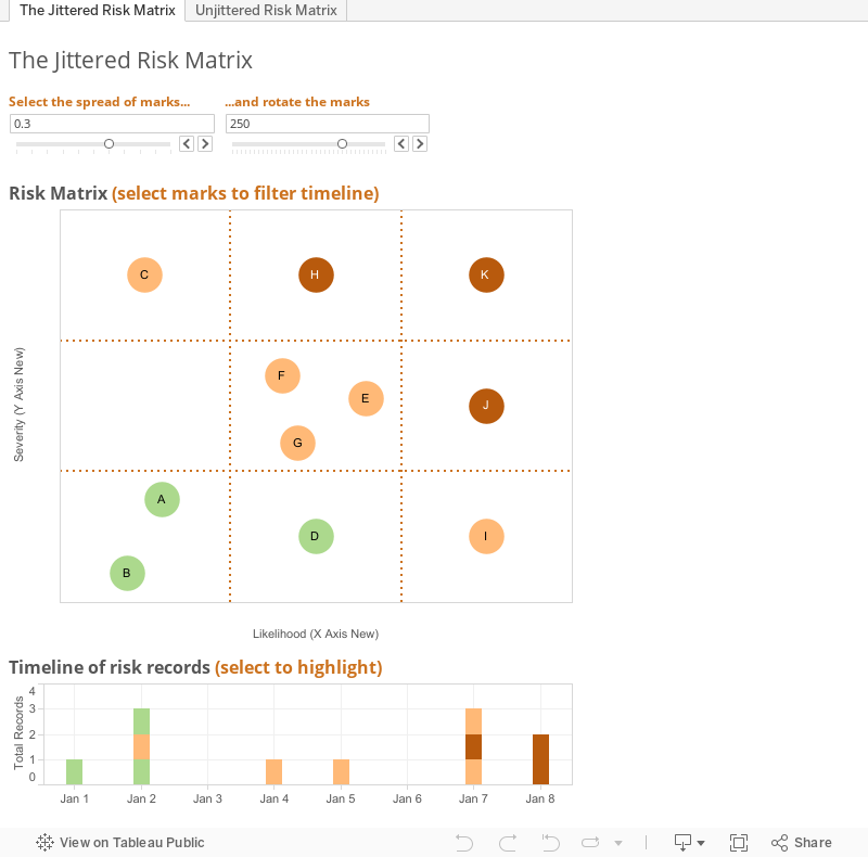
Creating a Risk Matrix in Tableau

As a regular Tableau user I’m guessing you have come across the term jittering*. You may have even worked out why you want to use it. However, a quick straw-poll in the office (not statistically accurate) showed that no-one had ever used jittering in anger. Well that is until now…

*For those that are new users, jittering is the idea that when marks on a two-dimensional scatterplot sit on top of each other, then you can adjust their values slightly so they appear from behind each other. For those who are building 3D scatterplots, please move swiftly on to Stephen Few’s blog to learn why I cringe as I type 3D.

The Problem…

During a Tableau support session, I came across a user who wanted to create a 3x3 risk matrix to include in a report. All risks were rated either low, medium or high on two metrics – likelihood and severity. There was also a lot of data (c. 1,000 rows). The user had resigned themselves to creating hundreds of versions of the matrix to cover all the various points as there is no automated way to complete this.

Well with a lot of help from reading from Alan Eldridge, Mark Jackson and a few other bloggers / community helpers, I came up with the following method. It uses Alan’s method as a base and then I have applied it to this particular challenge so all (any) praise in his direction please.

My thought process went as follows:
1.     Allocate a numeric risk to the current risk rating
2.     Create unique risk pairs (ie medium / low, high / medium etc)
3.     Use Alan’s methodology for jittering around a given point, manipulating the calcs to fit my data

4.     Design the risk matrix through reference lines, remove gridlines, tick marks and add annotations

Hope it's useful for you.


Friday, 28 November 2014

One small step for Tableau, one giant leap for data visualisation kind

I’ve had an idea, it came whilst I was travelling across the French and Belgium border on the Eurostar so I need to sense check this. 

Tableau offers the user in Desktop to colour the view in a number of ‘steps’. You can access this by clicking on the Colour panel of the marks card when a measure is active on colour so why not for size?

Obviously there are a few workarounds to create this by binning a measure or grouping a set of dimensions but it doesn’t have that Tableau ease of being able to do it there and then, changing the centre point of the stepping etc. 
I have found a number of times when I would like to use size on a map or scatterplot and Tableau has not computed enough differentiation between them (even when there is to me as a reader). So why not allow for a grouping of sorts but for sizes purpose? 

Has anyone else found this and how else do they get around it? Or, have a critique of my idea?