Tim Harford - (Mis)Information is Beautiful keynote
- If you are a data visualisation guru you will have come across the Florence Nightingale story of visualisation many times. An innovative visualiser but she was still arguing a point and hence she used a coxcomb diagram.
- Florence had the dubious honour of creating one of the first infographics. Tim did point out she saved '000s of people but still... Have a read of wtfviz.net - you'll thank Tim for pointing it out.
- Misinformation is an issue in infographics. Height used for icons, forgets to work out the area implications.
- Here is the link to Tim's reference to Saturday Morning Breakfast Cereal - http://www.smbc-comics.com/index.php?db=comics&id=3167. A quick reference as to why info graphics have to be treated with care.
- Tim showed the example of the New York subway lines inequality line. Here is the London equivalent for house prices - http://www.standard.co.uk/news/london/interactive-map-of-london-underground-shows-how-capitals-house-prices-stack-up-9106901.html
- Tim played Debtris by Information is Beautiful - Debtris (UK version) - YouTube. He then pulls apart some of the "costs" referenced by McCandless. Not coming apples with apples. Visualisation is becoming easy but... "You don't have to think, but I recommend it. Pro tip"
- Tim highlights it's not enough to be beautiful, it has to be sound work. He understand when someone 'smooth talks' us without substance. Not everyone has developed the ability to see the gaps being presented.
- Dazzle camouflage in military shipping is a similar analogy to info graphics.
- Be careful of:
1. People that lie with data
2. People who haven't taken care of how the are visualising
3. People who are not careful of the metrics they use
Matt Francis - Once Upon a Tableau - The How and Why of Story
- 220 slides (seriously!) of hilarity!
- Tableau Public is a great learning resource - download something that makes you go woah and you can download it to learn how it was done.
- Stories are important because they are: more Memorable, Impactful and Relatable
- Matt talks about Sequential Art - a way to transmit human experience so why not use Sequential Data Visualisation
- Data viz should be unbiased and neutral (I'd say can it be?). Data stories lead a reader in a certain direction. You are influencing through a guided tour
- You need to:
1. Consider your plot - plan out what you are going to do
2. Consider your audience - harks back to Paul Banoub's idea of present to Homer as well as Lisa Simpson
- Matt went through his thinking on creating his:
1. Sunspots visualisation - http://wannabedatarockstar.blogspot.co.uk/2014/02/how-sun-controls-weather_21.html
2. The Greatest F1 driver - http://wannabedatarockstar.blogspot.co.uk/2014/03/who-is-greatest-f1-driver.html
3. Malaria - the global problem - http://wannabedatarockstar.blogspot.co.uk/2014/04/malaria-global-preventable-diesase.html
- "Hit people with the numbers and make it relatable" create an emotional impact, like the use of the school bus in the Malaria viz
- Matt's do's and don'ts:
1. Don't use it for everything. Single dashboards are effective and also multiple dashboards but question whether it is the right choice
2. Don't waste space - "each story point must earn it's place"
3. Do share the right story point - the 'Share' URL you have on your screen is for the point you are on when you click share.
The Final Keynote - Kenneth Cukier (data editor at the Economist)
- http://www.economist.com/blogs/graphicdetail is an accessible reference for some of Kenneth's team reference
- Kenneth uses the example of the Consumer Price Index (CPI) that is made up (like a lot of the financial indices) are a large number of measures. Changes to all underlying factors can now be visualised in seconds.
- "n=all" before you used to have to sample, now you can use all of the data. Data visualisation allows you to see all of the data and the trends.
- Information growth in digital sources is exponential and it's growth is unlikely to change. Even with this data growth, there is a need to show all of it.
- The use of different visualisation has allowed information never seen as data, suddenly be visualised and insight taken from it.
- By disaggregating data, you can find new uses and ways to look at this information. Fo example, employment data like this: http://www.nytimes.com/interactive/2014/06/05/upshot/how-the-recession-reshaped-the-economy-in-255-charts.html?_r=0
- New techniques are still required to tell different and more interesting stories. You have to explore the data without conceived ideas about what you are going to find. Remove Preconceived Notions! Observe first, answer afterwards.
- Kenneth still battles to get the visualisation in to the magazine that depicts the data best vs. what is easily accessible. Has "failed" multiple times with 'innovative' visualisations but hits home runs that shows you need to keep pushing the boundaries.
- The world cup has been a testbed for the media's large dataset visualisations (social media etc)
- Need to be aware of access, ethics, privacy, ownership, "data-ism" (a new alchemy that needs to be treated with care and be cautious). Need to remember the humanity behind the data.
...now off to the London Tableau User Group. Great conference and thank you to all those who made it a special couple of days.
Wednesday, 9 July 2014

Tuesday, 8 July 2014
Tableau on tour - reaches London
Ok, here is my attempt at live blogging so this page will capture my thoughts and key ideas throughout the conference (if the wifi holds up).
Opening keynote:
- 7,000 people expected in Seattle for the global conference this year. Should be epic!
- A great demonstration of Tableau Public through Paul Banoub's cup stacking viz
- Francois Ajenstat giving really good insights into the founding of Tableau. Chris, Christian and Pat had to produce multiple visualisation to describe some code - they desired to find an easy way to do this.
- Key areas for development for tableau:
1. Seamless access to data - new data load in 8.2 a key part of this
2. Analytics and statistics for everyone - sophisticated modelling in one click. Mapping the big development in 8.2. Data search to be developed in future releases.
3. Visual Analytics everywhere - Dave Story - former Lucas Films BI guru, now mobile and strategic growth VP highlights edit function on server to explore further through 'edit' functionality.
4. Storytelling - Powerpoint just isn't enough anymore! Check out my Viz of the Day in the article below to see more.
5. Enterprise - Tableau. Online and Public shows scalability. New administration functions in 8.2 to add, edit and delete users / workbooks the latest iteration.
6. Fast, easy, beautiful - Tableau want you to have a "conversation with the data so the software fades away". Subtle changes like responsive marks on maps, seamless movement around maps etc
Paul Banoub's talk on building a Tableau Centre of Excellence
- UBS using Tableau for IT, Business, Finance and HR
- It's not just about Tableau it's about Visualisation best practice.
- Design for Homer as well as Lisa Simpson - don't just build shareable work for people like you. It won't have the same benefit if not.
- Proof of concepts and communities are key ways to find who gets hooked on Tableau. Similar experience for me too apart from people who see Tableau over your shoulder and go "I want to do that"
- Virtual Hosting, Monitoring (great work by Mike Roberts formerly of Interworks that I will need to read after), Configuration all need to be considered to create the polished user experience that Tableau is designed for. Landing pages on intranet and style guides help users to get better results sooner (ref. Mark Jackson's blog ugamarkj.blogspot.com)
- Purchaisng and onboarding new users is cruical to the user experience. It can really put people off Tableau if you falter and are not timely. *nods*
- Monthly and Quarterly structured training sessions (including Tableau doctor sessions) have helped people excel and drive themselves further.
Bethany Lyons - data blending
- Data blending is a left outer join (everything from left (primary) and brings in just the stuff that matches in the right (secondary)). Inner joins are also possible by excluding any nulls. Can't do full outer joins through blends.
- Try to aggregate through linking fields for better performance. These will be the most common request anyway.
- The combination of highlighted link icons will create the unique combination of data points to be joined. Over selection of data links leads to data reduction (data points disappearing) if you just select everything but are actually not concerned about that unique combination of data points. - To prevent data loss then you need to pad the domain - this means adding null values to ensure there is a cross over between both data sets on all of the linking fields
- * value of doom (hopefully will be called the Death Star) - occurs when your secondary data source has a many-to-one relationship with the primary data source. This doesn't happen with joins as joins create additional rows of data but likely will duplicate the measure value.
- If you want to filter between two data sources, joins are the way to go. Because when one set is used as a filter but it has no concept of that filter in the second data source, Tableau can't filter it. - You could then join these two source abut blend in the measures to avoid duplication of values.
Jock McKinley
- Story arc - Question or problem, Logical sequence or narrative, and Conclusion or Resolution
- Three types of use of visualisation in storytelling - 1. Find, 2. Tell and 3. Explore
- Tell - Jock used a great connected Scatterplot on road fatalities in motor vehicles by Hannah Fairfield. Chart run through the story and annotation is all around. Body of text in large dead white space. Very much a tell style.
- Use "Information Scent" (highlight function in Tableau) to lead others to explore your data.
- Explore - people don't expect data views to be a place to explore. You need to show them you can and how. D3 line charts used heavily in good examples. Allows people to explore.
- Collaborate - share and you never know where someone will take your data and story too.
- This will truly create a tree of knowledge
Andy Kriebel and Dan Murray
- Dan - "Andy is the smartest dumb guy you'll ever meet" nice!
- 1st user meeting was 2009 in Atlanta, Andy Cotgrave created the 1st User Group in the UK in 2010 (a contentious point!)
- 10. Rules of running a good user group:
1. Multiple companies and leaders mean that there is a good supply of organisers and spaces to choose from
2. Make it a no sales zone - listen to what the users want
3. Make it routine - monthly or quarterly so people can get it in to their diaries
4. Central location, easy accessibility key to remove excuses not to attend
5. Webinar make it tough as you don't really get to meet people. Allow webex, but just don't promote it
6. Andy - "beer helps"
7. 3-4 hours is key duration time
8. What? Guest speaker (can be wider than Tabelau), hands on training (helps newbies, don't go too advanced), give a random data set and allow people to build.
9. You want people to get hooked to come back so the takeaway learnings need to be good
10. Always have the next meeting ready to go...
Bethany Lyons - Table Calculations
- All the major work is done within advanced settings of the table calc. Using this rather than the drop downs mean that as you change the visualisation, the table calculation will remain calculating what you want by what you want
- Difference from average - sum(sales)-window_avg(sum(sales))
- You can nest as many table calculations as you want. You'd be crazy or a zen master to do this but you could
- dayofyear - is a number of the day in the year and is used within date part calculation syntax (I've never come across it)
- Last() is the table calculation that I always forget about but saves working on date calculations
- ATTR is a way to aggregate dimensions to be used within table calcs where you are using aggregated measures
- Jittering in a box-plot - use index() and change the partition to be your dimension
Opening keynote:
- 7,000 people expected in Seattle for the global conference this year. Should be epic!
- A great demonstration of Tableau Public through Paul Banoub's cup stacking viz
- Francois Ajenstat giving really good insights into the founding of Tableau. Chris, Christian and Pat had to produce multiple visualisation to describe some code - they desired to find an easy way to do this.
- Key areas for development for tableau:
1. Seamless access to data - new data load in 8.2 a key part of this
2. Analytics and statistics for everyone - sophisticated modelling in one click. Mapping the big development in 8.2. Data search to be developed in future releases.
3. Visual Analytics everywhere - Dave Story - former Lucas Films BI guru, now mobile and strategic growth VP highlights edit function on server to explore further through 'edit' functionality.
4. Storytelling - Powerpoint just isn't enough anymore! Check out my Viz of the Day in the article below to see more.
5. Enterprise - Tableau. Online and Public shows scalability. New administration functions in 8.2 to add, edit and delete users / workbooks the latest iteration.
6. Fast, easy, beautiful - Tableau want you to have a "conversation with the data so the software fades away". Subtle changes like responsive marks on maps, seamless movement around maps etc
Paul Banoub's talk on building a Tableau Centre of Excellence
- UBS using Tableau for IT, Business, Finance and HR
- It's not just about Tableau it's about Visualisation best practice.
- Design for Homer as well as Lisa Simpson - don't just build shareable work for people like you. It won't have the same benefit if not.
- Proof of concepts and communities are key ways to find who gets hooked on Tableau. Similar experience for me too apart from people who see Tableau over your shoulder and go "I want to do that"
- Virtual Hosting, Monitoring (great work by Mike Roberts formerly of Interworks that I will need to read after), Configuration all need to be considered to create the polished user experience that Tableau is designed for. Landing pages on intranet and style guides help users to get better results sooner (ref. Mark Jackson's blog ugamarkj.blogspot.com)
- Purchaisng and onboarding new users is cruical to the user experience. It can really put people off Tableau if you falter and are not timely. *nods*
- Monthly and Quarterly structured training sessions (including Tableau doctor sessions) have helped people excel and drive themselves further.
Bethany Lyons - data blending
- Data blending is a left outer join (everything from left (primary) and brings in just the stuff that matches in the right (secondary)). Inner joins are also possible by excluding any nulls. Can't do full outer joins through blends.
- Try to aggregate through linking fields for better performance. These will be the most common request anyway.
- The combination of highlighted link icons will create the unique combination of data points to be joined. Over selection of data links leads to data reduction (data points disappearing) if you just select everything but are actually not concerned about that unique combination of data points. - To prevent data loss then you need to pad the domain - this means adding null values to ensure there is a cross over between both data sets on all of the linking fields
- * value of doom (hopefully will be called the Death Star) - occurs when your secondary data source has a many-to-one relationship with the primary data source. This doesn't happen with joins as joins create additional rows of data but likely will duplicate the measure value.
- If you want to filter between two data sources, joins are the way to go. Because when one set is used as a filter but it has no concept of that filter in the second data source, Tableau can't filter it. - You could then join these two source abut blend in the measures to avoid duplication of values.
Jock McKinley
- Story arc - Question or problem, Logical sequence or narrative, and Conclusion or Resolution
- Three types of use of visualisation in storytelling - 1. Find, 2. Tell and 3. Explore
- Tell - Jock used a great connected Scatterplot on road fatalities in motor vehicles by Hannah Fairfield. Chart run through the story and annotation is all around. Body of text in large dead white space. Very much a tell style.
- Use "Information Scent" (highlight function in Tableau) to lead others to explore your data.
- Explore - people don't expect data views to be a place to explore. You need to show them you can and how. D3 line charts used heavily in good examples. Allows people to explore.
- Collaborate - share and you never know where someone will take your data and story too.
- This will truly create a tree of knowledge
Andy Kriebel and Dan Murray
- Dan - "Andy is the smartest dumb guy you'll ever meet" nice!
- 1st user meeting was 2009 in Atlanta, Andy Cotgrave created the 1st User Group in the UK in 2010 (a contentious point!)
- 10. Rules of running a good user group:
1. Multiple companies and leaders mean that there is a good supply of organisers and spaces to choose from
2. Make it a no sales zone - listen to what the users want
3. Make it routine - monthly or quarterly so people can get it in to their diaries
4. Central location, easy accessibility key to remove excuses not to attend
5. Webinar make it tough as you don't really get to meet people. Allow webex, but just don't promote it
6. Andy - "beer helps"
7. 3-4 hours is key duration time
8. What? Guest speaker (can be wider than Tabelau), hands on training (helps newbies, don't go too advanced), give a random data set and allow people to build.
9. You want people to get hooked to come back so the takeaway learnings need to be good
10. Always have the next meeting ready to go...
Bethany Lyons - Table Calculations
- All the major work is done within advanced settings of the table calc. Using this rather than the drop downs mean that as you change the visualisation, the table calculation will remain calculating what you want by what you want
- Difference from average - sum(sales)-window_avg(sum(sales))
- You can nest as many table calculations as you want. You'd be crazy or a zen master to do this but you could
- dayofyear - is a number of the day in the year and is used within date part calculation syntax (I've never come across it)
- Last() is the table calculation that I always forget about but saves working on date calculations
- ATTR is a way to aggregate dimensions to be used within table calcs where you are using aggregated measures
- Jittering in a box-plot - use index() and change the partition to be your dimension
Thursday, 26 June 2014
The Revised NBA Draft
The NBA draft is the equivalent of Christmas for most NBA fans (except Cleveland but I will come to that). Previously for the last couple of decades, David Stern (playing the role of Santa) rocks up to the podium (read Christmas tree) and tells you which teenager you will be cheering on for the next decade.
This year Adam Silver, the new NBA Santa, will read out the names of the players in which your sporting hopes will rest. If you have been good (or your team has an awesome GM) then you will land a star player that will guide your team to championship, after championship (thanks Timmy!). If you are Cleveland or Portland then you draft a player that will leave you for a more desirable location or have fundamental health issues.
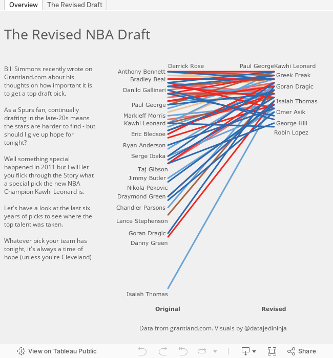
So how much does it matter if you pick first, second or sixtieth? Bill Simmons, king of Sports Satire, this week published an article looking at which order the players from the last couple of decades would those players go.
Here's the article for those who want to have a read - http://grantland.com/features/nba-draft-crapshoot-repick-1995/
Well as I was reading, I thought of only one thing - slope chart!
I hope you enjoy the new storyboarding feature in Tableau as I walk you through the last six years of the NBA draft showing there is still hope for all.
This year Adam Silver, the new NBA Santa, will read out the names of the players in which your sporting hopes will rest. If you have been good (or your team has an awesome GM) then you will land a star player that will guide your team to championship, after championship (thanks Timmy!). If you are Cleveland or Portland then you draft a player that will leave you for a more desirable location or have fundamental health issues.
So how much does it matter if you pick first, second or sixtieth? Bill Simmons, king of Sports Satire, this week published an article looking at which order the players from the last couple of decades would those players go.
Here's the article for those who want to have a read - http://grantland.com/features/nba-draft-crapshoot-repick-1995/
Well as I was reading, I thought of only one thing - slope chart!
I hope you enjoy the new storyboarding feature in Tableau as I walk you through the last six years of the NBA draft showing there is still hope for all.
Monday, 26 May 2014
Quantified Self
I have the joy of living in London. This includes many amazing things: the history, the architecture, the museums, the beer but there is one thing that blights the London experience for me - the Tube.
That's right the London Underground is my pet hate. Don't get me wrong it's a brilliant transport system - people make 24 million journeys on it every day (tfl.gov.uk). But that is the issue for a 6' 3" guy, I just don't fit in very well. So for a quantified self project I wanted to not just help myself solve this, but create something that will help others. So I came up with...
The London Runderground.
Every year about 15 million international tourists come to London and they move round primarily on the tube. But they have no other option if they want to visit the sights, right? No Wrong! Why not run between the attractions?
To prove the benefits I have tried to be as fair as possible. I didn't train for the runs, I didn't do it on a nice cool day (it was a stifling London day), I just rocked up in a pair of trainers and my iPhone (to use RunKeeper.com) and ran. I have just used the tfl.gov.uk website to calculate the tube journeys but these don't take in to account:
Here are my results - and trust me it is a lot nicer than riding the tube for nine journeys (and cheaper!!). Plus, I made a couple of journeys faster. Oh and the biggest benefit is I could enjoy my fish and chips in the evening as I had already worn off the "treat".

That's right the London Underground is my pet hate. Don't get me wrong it's a brilliant transport system - people make 24 million journeys on it every day (tfl.gov.uk). But that is the issue for a 6' 3" guy, I just don't fit in very well. So for a quantified self project I wanted to not just help myself solve this, but create something that will help others. So I came up with...
The London Runderground.
Every year about 15 million international tourists come to London and they move round primarily on the tube. But they have no other option if they want to visit the sights, right? No Wrong! Why not run between the attractions?
To prove the benefits I have tried to be as fair as possible. I didn't train for the runs, I didn't do it on a nice cool day (it was a stifling London day), I just rocked up in a pair of trainers and my iPhone (to use RunKeeper.com) and ran. I have just used the tfl.gov.uk website to calculate the tube journeys but these don't take in to account:
- The time to get from the attraction to the station
- The time to get down to the platform once at the station (there are a lot of escalators)
- Delays
- Line closures
Here are my results - and trust me it is a lot nicer than riding the tube for nine journeys (and cheaper!!). Plus, I made a couple of journeys faster. Oh and the biggest benefit is I could enjoy my fish and chips in the evening as I had already worn off the "treat".
Monday, 17 March 2014
Tableau's Sports Viz Contest - the Interactive Shot Chart
So Tableau have thrown down the gauntlet and it's the first data viz competition to see who gets to complete in the Iron Viz championship at the Customer Conference. I had the pleasure of watching the competition last year and it was great. Seeing three great visualisers tackle the same data set in so many different ways made me feel there is no right way - it's all about the experimentation to see what stories you can find.
This year's first challenge is to create a sports based visualisation. For me there was only every going to be one thing I was going to do and it was to create an interactive basketball shot chart. For a long time now, I have admired and followed the work of Kirk Goldsberry. For example:

Kirk's chart are simply beautiful, fun and clear. I really enjoy the comic book (graphic novel??) styling. But, I want a little more...
I want to understand: When the shot is happening? Who made the pass? What was the flow of the game at the time?
But linking the final pass to the shot tells an even more interesting story - click on the second tab to see how path analysis helps with this. Just check out Spurs dominance on the defence's right hand side after failing from the left before hand.
Therefore, I have created this as my entry in the Iron Viz competition. I hope you enjoy it as much as I enjoyed creating it.

This year's first challenge is to create a sports based visualisation. For me there was only every going to be one thing I was going to do and it was to create an interactive basketball shot chart. For a long time now, I have admired and followed the work of Kirk Goldsberry. For example:
Kirk's chart are simply beautiful, fun and clear. I really enjoy the comic book (graphic novel??) styling. But, I want a little more...
I want to understand: When the shot is happening? Who made the pass? What was the flow of the game at the time?
But linking the final pass to the shot tells an even more interesting story - click on the second tab to see how path analysis helps with this. Just check out Spurs dominance on the defence's right hand side after failing from the left before hand.
Therefore, I have created this as my entry in the Iron Viz competition. I hope you enjoy it as much as I enjoyed creating it.
Thursday, 13 March 2014
It's Tableau Sports Viz month
Anyone who knows me, knows I am basketball obsessed!

I recently realised that I often form ideas when watching games. Who is the best 3 point shooting team? Who scores well from the three point line, but fails miserably as a foul shooter?
A while ago I created this for the 2011-2012 season (and will update shortly) but I have been watching games recently and haven't had my laptop close-by. So I'm publishing this to the blog so it is available whenever I get in to a debate about how great Kawhi Leonard is, I can prove it!
Sunday, 9 February 2014
Previously on 24...
Fate made me make the first 24 visualisation due to a conversation in the office, and it has had it's hand in this follow up entry too.
With the help of the previous entry, my blog hit 24 hundred views (2,469 to be precise) so a follow up had to be made - fate made it so!
So what else can be looked at in 24 through the eyes of adata visualiser? Deaths, thats what. I stumbled up (read googled) a great source of 24 knowledge - a wiki dedicated to 24! Click the link, its' worth it: http://24.wikia.com/wiki/Deaths_on_24
So did Jack Bauer stop the 'Hostiles'? Were the public safe? Use the visualisation to explore who were the killers. And this is more evidence that you can truly create a data visualisation out of anything (especially with Tableau).

With the help of the previous entry, my blog hit 24 hundred views (2,469 to be precise) so a follow up had to be made - fate made it so!
So what else can be looked at in 24 through the eyes of adata visualiser? Deaths, thats what. I stumbled up (read googled) a great source of 24 knowledge - a wiki dedicated to 24! Click the link, its' worth it: http://24.wikia.com/wiki/Deaths_on_24
So did Jack Bauer stop the 'Hostiles'? Were the public safe? Use the visualisation to explore who were the killers. And this is more evidence that you can truly create a data visualisation out of anything (especially with Tableau).
Subscribe to:
Posts (Atom)